


Define or explain the concepts: Simple Bar Diagram.
Answer
552.3k+ views
Hint: We first explain the process of creating the chart and the application for a simple bar diagram. The components get represented in a single bar. The representation can not be represented as total stacked.
Complete step by step solution:
A simple bar chart is used to represent data involving only one variable classified on a spatial, quantitative or temporal basis. In a simple bar chart, we make bars of equal width but variable length i.e., the magnitude of a quantity is represented by the height or length of the bars.
We first discuss the processes of how to draw a simple bar diagram.
First, we draw two perpendicular lines, one horizontally and the other vertically, at an appropriate place on the paper.
Then we take the basis of classification along the horizontal line of X-axis and the observed variable along the vertical line Y-axis or vice versa.
Then we mark signs of equal breadth for each class and leave equal or not less than half a breadth between two classes.
Then we place the values of the given data or chart.
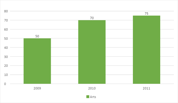
We take an example of the number of students passing in arts in three consecutive years.
Stream
Note:
We face some difficulties in case of simple bar diagrams. Minute differences in values cannot be represented properly in diagrams. Large differences in values spoil the look of the diagram.
Complete step by step solution:
A simple bar chart is used to represent data involving only one variable classified on a spatial, quantitative or temporal basis. In a simple bar chart, we make bars of equal width but variable length i.e., the magnitude of a quantity is represented by the height or length of the bars.
We first discuss the processes of how to draw a simple bar diagram.
First, we draw two perpendicular lines, one horizontally and the other vertically, at an appropriate place on the paper.
Then we take the basis of classification along the horizontal line of X-axis and the observed variable along the vertical line Y-axis or vice versa.
Then we mark signs of equal breadth for each class and leave equal or not less than half a breadth between two classes.
Then we place the values of the given data or chart.
We take an example of the number of students passing in arts in three consecutive years.
Stream
| Stream | 2009 | 2010 | 2011 |
| Arts | 50 | 70 | 75 |
Note:
We face some difficulties in case of simple bar diagrams. Minute differences in values cannot be represented properly in diagrams. Large differences in values spoil the look of the diagram.
Recently Updated Pages
Master Class 10 Computer Science: Engaging Questions & Answers for Success
Master Class 10 General Knowledge: Engaging Questions & Answers for Success
Master Class 10 English: Engaging Questions & Answers for Success
Master Class 10 Social Science: Engaging Questions & Answers for Success
Master Class 10 Maths: Engaging Questions & Answers for Success
Master Class 10 Science: Engaging Questions & Answers for Success
Trending doubts
What is the median of the first 10 natural numbers class 10 maths CBSE
Which women's tennis player has 24 Grand Slam singles titles?
Who is the Brand Ambassador of Incredible India?
Why is there a time difference of about 5 hours between class 10 social science CBSE
Write a letter to the principal requesting him to grant class 10 english CBSE
A moving boat is observed from the top of a 150 m high class 10 maths CBSE