


Draw a bar graph for the following data.
The population of India in successive census years.
Year 1941 1951 1961 1971 1981 1991 2001 Population (in millions)(approx.) 320 360 440 550 680 850 1000
| Year | 1941 | 1951 | 1961 | 1971 | 1981 | 1991 | 2001 |
| Population (in millions)(approx.) | 320 | 360 | 440 | 550 | 680 | 850 | 1000 |
Answer
573k+ views
Hint: For drawing the graph we take the years on X-axis and population on Y-axis. By assuming some scale to both the axes we plot the graph in rectangles each year, which means we take ten years as one unit which will be the breadth of the rectangle and the population as the length of the rectangle.
Complete step-by-step answer:
Let us assume the years on X-axis and the population on Y-axis.
Now, let us create a table extending the given data to one column of having the coordinates of points to be represented on the graph as follows
Now, let us take the scale.
On X-axis 1 unit is equal to 10 years and on the Y-axis 1 unit is equal to 200 million.
By using this scale let us plot the bar graph of the given data.
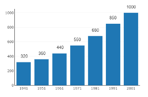
Hence, the bar graph of the given data is drawn.
Note: Students may miss some points that are listed below.
We need to draw a bar graph in rectangles, not as points.
After drawing the rectangles, we have to give some color or design or some shading to the rectangles to avoid confusion.
Mention corresponding Y-axis values on the rectangles to avoid confusion.
The years need to be taken in the range which means we take the same population over the decade because it is a bar graph.
Complete step-by-step answer:
Let us assume the years on X-axis and the population on Y-axis.
Now, let us create a table extending the given data to one column of having the coordinates of points to be represented on the graph as follows
| Year | Population (in millions) | Co-ordinates |
| 1941 | 320 | (1941, 320) |
| 1951 | 360 | (1951, 360) |
| 1961 | 440 | (1961, 440) |
| 1971 | 550 | (1971, 550) |
| 1981 | 680 | (1981, 680) |
| 1991 | 850 | (1991, 850) |
| 2001 | 1000 | (2001, 1000) |
Now, let us take the scale.
On X-axis 1 unit is equal to 10 years and on the Y-axis 1 unit is equal to 200 million.
By using this scale let us plot the bar graph of the given data.
Hence, the bar graph of the given data is drawn.
Note: Students may miss some points that are listed below.
We need to draw a bar graph in rectangles, not as points.
After drawing the rectangles, we have to give some color or design or some shading to the rectangles to avoid confusion.
Mention corresponding Y-axis values on the rectangles to avoid confusion.
The years need to be taken in the range which means we take the same population over the decade because it is a bar graph.
Recently Updated Pages
Master Class 11 Computer Science: Engaging Questions & Answers for Success
Master Class 11 Business Studies: Engaging Questions & Answers for Success
Master Class 11 Economics: Engaging Questions & Answers for Success
Master Class 11 English: Engaging Questions & Answers for Success
Master Class 11 Maths: Engaging Questions & Answers for Success
Master Class 11 Biology: Engaging Questions & Answers for Success
Trending doubts
One Metric ton is equal to kg A 10000 B 1000 C 100 class 11 physics CBSE
There are 720 permutations of the digits 1 2 3 4 5 class 11 maths CBSE
Discuss the various forms of bacteria class 11 biology CBSE
Draw a diagram of a plant cell and label at least eight class 11 biology CBSE
State the laws of reflection of light
Explain zero factorial class 11 maths CBSE