


Draw a pie chart for the following information: -
Ice-cream flavours Strawberry Mango Vanilla Butterscotch Others % of preference 20% 25% 40% 10% 5%
| Ice-cream flavours | Strawberry | Mango | Vanilla | Butterscotch | Others |
| % of preference | 20% | 25% | 40% | 10% | 5% |
Answer
553.5k+ views
Hint: First understand the meaning of a pie chart and how to draw it. Draw a circle of any radius ‘r’ and divide its circumference into 10 parts of equal arc length. Assume that each part represents 10% share. Now, consider the parts of the circle according to the percentage preference of difference flavours provided.
Complete step-by-step answer:
Here, we have been provided with a table that represents the information regarding the percentage preference of different ice-cream flavours. We have been asked to draw a pie chart for the given data. But first we need to understand the meaning of a pie chart.
Now, in mathematics, a pie chart is a circular statistical graph that is divided into different sectors to represent the proportion of data provided. In a pie chart, the arc length or we can say that the central angle and area is proportional to the quantity it represents.
Let us come to the question. Since, we have been provided with the percentage preference of different ice-cream flavours, so on observing the data carefully we can say that if would be beneficial for us if we will draw a circle and divide it into 10 parts of equal arc length such that each part of the circle or we can say, each sector represents 10% of the total circle. So, drawing the pie – chart according to the given data, we get,
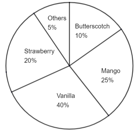
Note: One may note that a pie chart has many variants, that means there are different types of representations of a circular chart. But here we have drawn a simple pie chart. Note that we have divided the circumference of the circle into 10 parts because we can see in the data that mainly the percentage preferences are multiples of 10. You must divide the circle into sectors of area according to the given data. You must also remember other types of representations of statistical data like: - bar graph, line graph, histograms etc.
Complete step-by-step answer:
Here, we have been provided with a table that represents the information regarding the percentage preference of different ice-cream flavours. We have been asked to draw a pie chart for the given data. But first we need to understand the meaning of a pie chart.
Now, in mathematics, a pie chart is a circular statistical graph that is divided into different sectors to represent the proportion of data provided. In a pie chart, the arc length or we can say that the central angle and area is proportional to the quantity it represents.
Let us come to the question. Since, we have been provided with the percentage preference of different ice-cream flavours, so on observing the data carefully we can say that if would be beneficial for us if we will draw a circle and divide it into 10 parts of equal arc length such that each part of the circle or we can say, each sector represents 10% of the total circle. So, drawing the pie – chart according to the given data, we get,
Note: One may note that a pie chart has many variants, that means there are different types of representations of a circular chart. But here we have drawn a simple pie chart. Note that we have divided the circumference of the circle into 10 parts because we can see in the data that mainly the percentage preferences are multiples of 10. You must divide the circle into sectors of area according to the given data. You must also remember other types of representations of statistical data like: - bar graph, line graph, histograms etc.
Recently Updated Pages
Master Class 10 Computer Science: Engaging Questions & Answers for Success
Master Class 10 General Knowledge: Engaging Questions & Answers for Success
Master Class 10 English: Engaging Questions & Answers for Success
Master Class 10 Social Science: Engaging Questions & Answers for Success
Master Class 10 Maths: Engaging Questions & Answers for Success
Master Class 10 Science: Engaging Questions & Answers for Success
Trending doubts
What is the median of the first 10 natural numbers class 10 maths CBSE
Which women's tennis player has 24 Grand Slam singles titles?
Who is the Brand Ambassador of Incredible India?
Why is there a time difference of about 5 hours between class 10 social science CBSE
Write a letter to the principal requesting him to grant class 10 english CBSE
A moving boat is observed from the top of a 150 m high class 10 maths CBSE