


Draw the frequency polygon of the following data using histogram.
Class interval 0-10 10-20 20-30 30-40 40-50 50-60 Frequency 5 10 25 16 12 8
| Class interval | 0-10 | 10-20 | 20-30 | 30-40 | 40-50 | 50-60 |
| Frequency | 5 | 10 | 25 | 16 | 12 | 8 |
Answer
531.6k+ views
Hint: We are first going to represent the above data in the form of a histogram using a bar graph. We have this graph plotted such that the horizontal axis consists of the class interval and the vertical axis contains the frequency. We shall then take the midpoints of these rectangular bars and plot a corresponding graph for the frequency polygon.
Complete step-by-step solution:
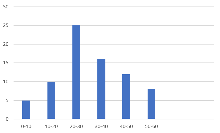
Consider the given question with the class intervals ranging from 0 all the way up to 60. This will form the horizontal axis for our bar graph. Now, the vertical axis contains values that are represented by the frequency given in the question. Using this data, we plot the bar graph as shown in the figure below.
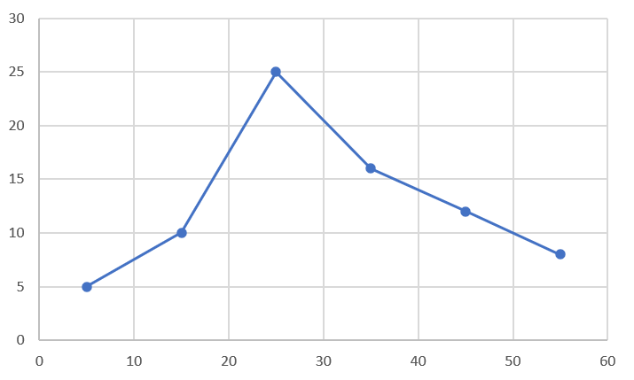
We shall find the mid points of each bar and this can be done by adding the upper limit and lower limit and dividing by 2.
$\Rightarrow Mid=\dfrac{U+L}{2}$
For the first bar having a frequency 5,
$\Rightarrow Mid1=\dfrac{10+0}{2}=5$
Similarly, for the second bar having a frequency 10,
$\Rightarrow Mid2=\dfrac{20+10}{2}=15$
Similarly, for the third bar having a frequency 25,
$\Rightarrow Mid3=\dfrac{30+20}{2}=25$
Similarly, for the fourth bar having a frequency 16,
$\Rightarrow Mid4=\dfrac{40+30}{2}=35$
Similarly, for the fifth bar having a frequency 12,
$\Rightarrow Mid5=\dfrac{50+40}{2}=45$
Similarly, for the sixth bar having a frequency 8,
$\Rightarrow Mid6=\dfrac{60+50}{2}=55$
Now, using this data, we plot a graph with points at these locations and they are connected by straight lines as shown in the figure. This represents the frequency polygon.
Note: It is to note that we can directly draw the frequency polygon by considering the mid points of each range and plotting for the corresponding frequency values. We have drawn additional histograms here for our better understanding. We are not required to draw the histogram for the given question.
Complete step-by-step solution:
Consider the given question with the class intervals ranging from 0 all the way up to 60. This will form the horizontal axis for our bar graph. Now, the vertical axis contains values that are represented by the frequency given in the question. Using this data, we plot the bar graph as shown in the figure below.
We shall find the mid points of each bar and this can be done by adding the upper limit and lower limit and dividing by 2.
$\Rightarrow Mid=\dfrac{U+L}{2}$
For the first bar having a frequency 5,
$\Rightarrow Mid1=\dfrac{10+0}{2}=5$
Similarly, for the second bar having a frequency 10,
$\Rightarrow Mid2=\dfrac{20+10}{2}=15$
Similarly, for the third bar having a frequency 25,
$\Rightarrow Mid3=\dfrac{30+20}{2}=25$
Similarly, for the fourth bar having a frequency 16,
$\Rightarrow Mid4=\dfrac{40+30}{2}=35$
Similarly, for the fifth bar having a frequency 12,
$\Rightarrow Mid5=\dfrac{50+40}{2}=45$
Similarly, for the sixth bar having a frequency 8,
$\Rightarrow Mid6=\dfrac{60+50}{2}=55$
Now, using this data, we plot a graph with points at these locations and they are connected by straight lines as shown in the figure. This represents the frequency polygon.
Note: It is to note that we can directly draw the frequency polygon by considering the mid points of each range and plotting for the corresponding frequency values. We have drawn additional histograms here for our better understanding. We are not required to draw the histogram for the given question.
Recently Updated Pages
Master Class 11 Computer Science: Engaging Questions & Answers for Success
Master Class 11 Business Studies: Engaging Questions & Answers for Success
Master Class 11 Economics: Engaging Questions & Answers for Success
Master Class 11 English: Engaging Questions & Answers for Success
Master Class 11 Maths: Engaging Questions & Answers for Success
Master Class 11 Biology: Engaging Questions & Answers for Success
Trending doubts
One Metric ton is equal to kg A 10000 B 1000 C 100 class 11 physics CBSE
There are 720 permutations of the digits 1 2 3 4 5 class 11 maths CBSE
Discuss the various forms of bacteria class 11 biology CBSE
Draw a diagram of a plant cell and label at least eight class 11 biology CBSE
State the laws of reflection of light
Explain zero factorial class 11 maths CBSE