


Draw the histogram and the Frequency polygon in the same figure for the following distribution:
Class Interval 0-30 30-60 60-90 90-120 120-150 Total Frequency 7 4 5 10 6 32
| Class Interval | 0-30 | 30-60 | 60-90 | 90-120 | 120-150 | Total |
| Frequency | 7 | 4 | 5 | 10 | 6 | 32 |
Answer
586.5k+ views
Hint: A histogram is a graphical method for displaying the shape of a distribution. We know the class interval and frequency. Class intervals will be represented on the x-axis and frequency will be represented on y-axis. Frequency polygon is plotted in the same manner as histograms except it is a line graph so points are calculated to plot the graph.
Complete step by step answer:
We will take a graph sheet and draw both the axes on it.
We will mark the class interval on the x-axis and frequency on the y-axis.
We know that intervals have a gap of 30 units each.
We know the 1unit=10 divisions on a graph sheet.
Mark the x-axis from 0 to 150 using 15 units on the sheet. 1unit= 10
Similarly mark the y-axis 0 to 10 using 10 units. 1unit= 1.
We will now plot the graph; we will make a bar of width 0 to 30 i.e. 30 divisions on x-axis and of height 7. The width 30 signifies the class interval and 7 signifies frequency of the corresponding class interval.
Similarly, we will plot for all the class intervals.
For Frequency polygon we will find out the midpoint of all the class interval and we will form a table as given below
We will plot the points which we get
E2(15,7)
E3(45,4)
E4(75,5)
E5(105,10)
E6(135,6)
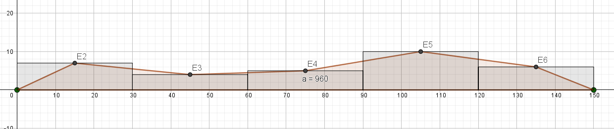
We will get the above graph.
Note: The histograms are the same as the bar graphs except they are used when the interval is given. It is important to represent class intervals by a single number to create the frequency polygon. Don’t take the lower-class limit or upper-class limit as the points to plot the frequency polygon.
Complete step by step answer:
We will take a graph sheet and draw both the axes on it.
We will mark the class interval on the x-axis and frequency on the y-axis.
We know that intervals have a gap of 30 units each.
We know the 1unit=10 divisions on a graph sheet.
Mark the x-axis from 0 to 150 using 15 units on the sheet. 1unit= 10
Similarly mark the y-axis 0 to 10 using 10 units. 1unit= 1.
We will now plot the graph; we will make a bar of width 0 to 30 i.e. 30 divisions on x-axis and of height 7. The width 30 signifies the class interval and 7 signifies frequency of the corresponding class interval.
Similarly, we will plot for all the class intervals.
For Frequency polygon we will find out the midpoint of all the class interval and we will form a table as given below
| Class Interval | 15 | 45 | 75 | 105 | 135 | Total |
| Frequency | 7 | 4 | 5 | 10 | 6 | 32 |
We will plot the points which we get
E2(15,7)
E3(45,4)
E4(75,5)
E5(105,10)
E6(135,6)
We will get the above graph.
Note: The histograms are the same as the bar graphs except they are used when the interval is given. It is important to represent class intervals by a single number to create the frequency polygon. Don’t take the lower-class limit or upper-class limit as the points to plot the frequency polygon.
Recently Updated Pages
Master Class 8 Social Science: Engaging Questions & Answers for Success
Master Class 8 English: Engaging Questions & Answers for Success
Class 8 Question and Answer - Your Ultimate Solutions Guide
Master Class 8 Maths: Engaging Questions & Answers for Success
Master Class 8 Science: Engaging Questions & Answers for Success
Master Class 9 General Knowledge: Engaging Questions & Answers for Success
Trending doubts
What is BLO What is the full form of BLO class 8 social science CBSE
Citizens of India can vote at the age of A 18 years class 8 social science CBSE
Full form of STD, ISD and PCO
Advantages and disadvantages of science
Right to vote is a AFundamental Right BFundamental class 8 social science CBSE
What are the 12 elements of nature class 8 chemistry CBSE