


The pie chart is divided into:
(A) sectors
(B) circles
(C) squares
(D) segments
Answer
527.1k+ views
Hint: A pie chart is a type of graph used to represent data. It is a type of pictorial representation of data. As the name suggests, the term ‘pie’ represents a whole and the slices in the pie chart represent the respective parts of a whole. We shall now discuss the construction of a pie chart and how it is used to represent a data set. This will give us the answer to our problem.
Complete step by step solution:
A pie chart is one of the most important pictorial form of data representation. It contains different parts also called pie in a pie chart. Each part forms a certain portion of the total percentage. The sum of all the parts is ${{360}^{\circ }}$. And the total value of a pie is constant and always 100%.
A pie chart as the name suggest is in the shape of a pie, that is, it is a circle in which all the different parts that make up some angle at the center of the circle are called sectors.
A pie chart is constructed by allotting the degree of a sector (say d) of a certain value as:
$\Rightarrow d=\left( \dfrac{\text{the value of data}}{\text{the sum of all the data}} \right)\times {{360}^{\circ }}$
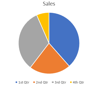
For example, the sales pie chart of a certain business in its four quarters can be represented as a pie chart with the help of following diagram:
Thus, from our above definition, we can see that a pie chart is divided into sectors.
So, the correct answer is “Option A”.
Note: The pie chart is extensively used to represent data in a business firm. It is used to compare the growth areas such as business profits, turnover, exposure, etc. Another very important characteristic of a pie chart is that it gives us a data comparison at just a glance while simultaneously giving us the accurate data of different variables visually.
Complete step by step solution:
A pie chart is one of the most important pictorial form of data representation. It contains different parts also called pie in a pie chart. Each part forms a certain portion of the total percentage. The sum of all the parts is ${{360}^{\circ }}$. And the total value of a pie is constant and always 100%.
A pie chart as the name suggest is in the shape of a pie, that is, it is a circle in which all the different parts that make up some angle at the center of the circle are called sectors.
A pie chart is constructed by allotting the degree of a sector (say d) of a certain value as:
$\Rightarrow d=\left( \dfrac{\text{the value of data}}{\text{the sum of all the data}} \right)\times {{360}^{\circ }}$
For example, the sales pie chart of a certain business in its four quarters can be represented as a pie chart with the help of following diagram:
Thus, from our above definition, we can see that a pie chart is divided into sectors.
So, the correct answer is “Option A”.
Note: The pie chart is extensively used to represent data in a business firm. It is used to compare the growth areas such as business profits, turnover, exposure, etc. Another very important characteristic of a pie chart is that it gives us a data comparison at just a glance while simultaneously giving us the accurate data of different variables visually.
Recently Updated Pages
Master Class 11 Computer Science: Engaging Questions & Answers for Success
Master Class 11 Business Studies: Engaging Questions & Answers for Success
Master Class 11 Economics: Engaging Questions & Answers for Success
Master Class 11 English: Engaging Questions & Answers for Success
Master Class 11 Maths: Engaging Questions & Answers for Success
Master Class 11 Biology: Engaging Questions & Answers for Success
Trending doubts
There are 720 permutations of the digits 1 2 3 4 5 class 11 maths CBSE
Discuss the various forms of bacteria class 11 biology CBSE
Draw a diagram of a plant cell and label at least eight class 11 biology CBSE
Explain zero factorial class 11 maths CBSE
What organs are located on the left side of your body class 11 biology CBSE
Draw a diagram of nephron and explain its structur class 11 biology CBSE