


Key Steps and Tips for Accurate Line Graph Drawing
Overview
How to Draw Line Graph in Statistics
It’s a graph that uses lines to connect individual data points from one to another. A line graph shows the quantitative values over a specified time interval.
In line graphs, the "markers" for the data points are connected by straight lines. Visualization is aided by the straight lines connecting these data points. Although line graphs are used in a wide range of industries and for a variety of reasons, they are particularly useful when it comes to creating a graphical representation of changes in values over time.
Types of Line Graphs
The line graphs can be divided into several groups:
1. Simple Line Graph: Only one line is plotted on the graph.
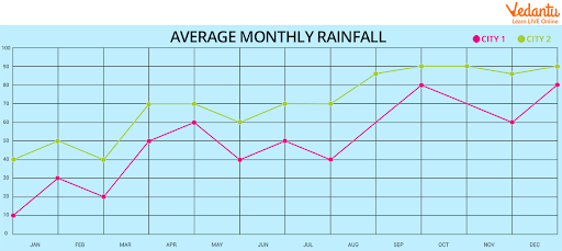
2. Multiple Line Graph: More than one line is plotted on the same set of axis. A multiple-line graph can help us to compare similar or different items over the same period.
Vertical Line Graph
Vertical line graphs are graphs in which a vertical line extends from each point of the data point down to the horizontal axis of the graph.
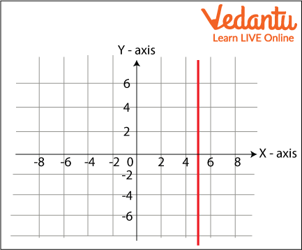
Vertical Line Graph
Horizontal Line Graph
Horizontal line graphs are graphs in which a horizontal line extends from each point of the data point parallel. A horizontal line graph is sometimes also known as row graph.
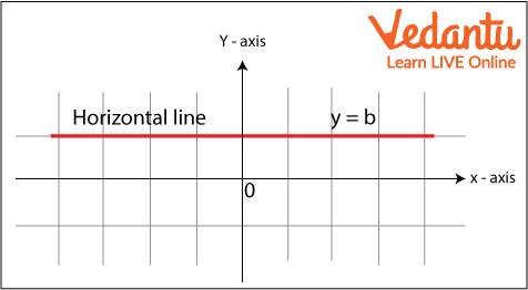
Horizontal Line
Different Terms of Line Graph
Title: The title tells what we are showing in the graph.
Scale: The scale is the numbers that explain the units taken on the linear graph.
Labels: Both the side and the bottom of the linear graph have a label that which data is represented on the given graph. The X-axis tells the data points on the line and the y-axis shows the numeric value for each point on the line.
Bars: They measure the data number.
Data values: They are the actual numbers represented for each data point.
How To Draw a Line Graph
Steps of Construction of Line Graph:
On a graph, draw two lines perpendicular to each other intersecting at point O. Mark points at equal intervals along the x-axis and writes the names of the data items whose values are to be mentioned.
Along the y-axis, choose an appropriate scale considering the given values.
Now, make the points
Join each and every point with the point using a ruler. Thus, a line graph is a ready
Example Graph
Line Graph in Statistics
A line graph is a tool used in statistics to analyze the trend of data that changes over a specified period of time. Here the time and data are represented on the x-and-y-axis. It is also known as a line chart.
Line Frequency Diagram
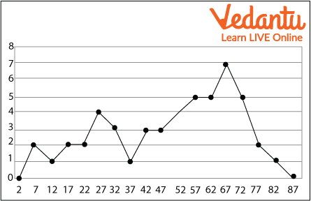
Line Frequency 1
In the above diagram you can see that the lines are not straight. It's because the data is not in the pattern when data is not in a pattern or you can say in a sequence that time the diagram turns out to be like frequency. That's why it’s called a frequency line diagram.
Line Graph Examples
Question: A bookstore created a line graph of how many books it sold each week during a specific time period. Determine how many fewer books were sold in week 8 than in week 7 using the data from the line graph above.
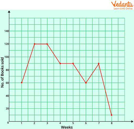
Week Sale Graph
Solution:
Number of books sold in week 7 = 90
Number of books sold in week 8 = 10
So, the difference = 80
Therefore, there were 80 fewer books sold in week 8 as compared to week 7.
Solved Questions
1. The following table gives information on the sum scored by McKay in 10 matches. Represent this online graph.
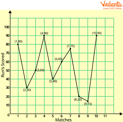
McKay Graph
2. Mobile phones sold by a shop in some week are as follows:
Represent the above data by using a line graph.
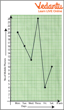
Mobile Phone Sold Graph
Summary
In this chapter we have studied the line graph, what is line graph, and how to draw and we have also studied the terms included in the graphs. We have solved various examples and questions to understand it better. Line graphs are frequently used in the financial industry to produce visual representations of values over time, including variations in security prices, financial statements from businesses, and histories of significant stock indices.
Line graphs can be compared with other visualizations of data like bar charts, pie charts, etc.
FAQs on How to Draw a Line Graph: A Complete Student Guide
1. What is a line graph and what is its primary use in Maths?
A line graph is a type of chart used to display information that changes over a continuous period. Its primary use is to show trends or changes in data over time. For example, it can be used to track the temperature change throughout a day, a company's profit over several years, or a plant's growth over a few weeks.
2. What are the essential steps to draw a line graph correctly?
To draw a line graph, you should follow these key steps in order:
Draw the Axes: Draw two perpendicular lines, the horizontal x-axis (for the independent variable, usually time) and the vertical y-axis (for the dependent variable, usually the quantity being measured).
Label the Axes: Clearly label what each axis represents, including units (e.g., 'Days', 'Temperature (°C)').
Determine the Scale: Choose a suitable and consistent scale for both axes that covers the entire range of your data.
Plot the Points: Mark the data points on the graph according to their corresponding x and y values.
Connect the Points: Use a ruler to connect the plotted points with straight line segments in order from left to right.
Add a Title: Give your graph a clear title that summarises what it shows.
3. Can you explain how to plot a line graph with a simple example?
Certainly. Imagine we want to plot the number of hours a student studied over 4 days. The data is: Day 1 (2 hours), Day 2 (3 hours), Day 3 (1 hour), Day 4 (4 hours).
First, draw an x-axis for 'Days' and a y-axis for 'Hours Studied'. Mark Days 1, 2, 3, 4 on the x-axis and a scale from 0 to 5 on the y-axis. Now, plot the points: (1, 2), (2, 3), (3, 1), and (4, 4). Finally, connect these points with straight lines to see the trend in study hours.
4. When should a student use a line graph instead of a bar graph?
You should use a line graph to show trends in continuous data over a period of time, like tracking monthly rainfall. In contrast, a bar graph is better for comparing data across discrete categories, such as the number of students who prefer different fruits. The key difference is continuous data (line graph) versus categorical data (bar graph).
5. Why is choosing the right scale for the axes so important when drawing a line graph?
Choosing the right scale is crucial because it directly affects the visual interpretation of the data. An inappropriate scale can be misleading. For instance, a very compressed scale can make significant changes look flat and unimportant, while a very stretched-out scale can exaggerate minor fluctuations, making them seem dramatic. A proper scale ensures the graph accurately represents the real trend in the data.
6. What is the difference between a simple line graph and a multiple line graph?
A simple line graph tracks and displays only one set of data. For example, it might show the temperature of one city over a week. A multiple line graph, on the other hand, plots two or more sets of data on the same axes. This is useful for comparing trends, such as plotting the weekly temperatures of three different cities simultaneously. Each line would be a different colour or style, explained in a key or legend.
7. What are some disadvantages or limitations of using a line graph?
While useful, line graphs have some limitations:
Clutter: They can become crowded and difficult to read if too many data lines are plotted on the same graph.
Data Type: They are best suited for numerical, continuous data and are not effective for comparing categorical data.
Range Issues: Plotting data with a very large range of values can be challenging and may obscure details in the smaller values.