


Draw a frequency polygon for the following data using histogram.
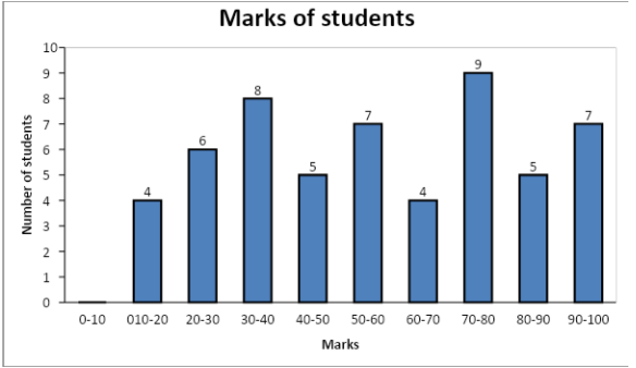
Marks 10-20 20-30 30-40 40-50 50-60 60-70 70-80 80-90 90-100 Number of students 4 6 8 5 7 4 9 5 7
| Marks | 10-20 | 20-30 | 30-40 | 40-50 | 50-60 | 60-70 | 70-80 | 80-90 | 90-100 |
| Number of students | 4 | 6 | 8 | 5 | 7 | 4 | 9 | 5 | 7 |
Answer
579.6k+ views
Hint:
We will draw a histogram for the given data. We will represent the frequency (number of students) for each class of marks using a bar. Then we will locate the midpoint of the upper horizontal side of each bar. Then we will join all the mid-points using line segments one after the other and this will give us the required frequency polygon.
Complete step by step solution:
We will make a histogram to represent the data in the table. On the X-axis, we will take all the class intervals (marks of students) and on the Y-axis, we will take the frequency (number of students).
There are no students who have got marks between 0 and 10, so we will make a class interval 0-10 (because the values on the x-axis start from 0.If we want to take values from 10, we will have to draw a kink)and take its frequency as 0.
Now we will find the midpoint of the upper horizontal side of each bar of the histogram. The midpoint of a class is given by \[M = \dfrac{{U + L}}{2}\] where M is the midpoint, U is the upper class limit and L lower class limit.
We will represent the data in the above table using a frequency polygon. We will represent the mid-points on the x-axis and the frequency on the y-axis.

Note:
Here, we have drawn a histogram because it becomes much easier to show different data of different ranges through bars. The taller bar represents more value in a particular range. We can also directly draw the polygon without making the histogram. We will directly find the mid-points of the given intervals and plot their corresponding frequencies on the y-axis. We will represent the mid-points on the x-axis.
We will draw a histogram for the given data. We will represent the frequency (number of students) for each class of marks using a bar. Then we will locate the midpoint of the upper horizontal side of each bar. Then we will join all the mid-points using line segments one after the other and this will give us the required frequency polygon.
Complete step by step solution:
We will make a histogram to represent the data in the table. On the X-axis, we will take all the class intervals (marks of students) and on the Y-axis, we will take the frequency (number of students).
There are no students who have got marks between 0 and 10, so we will make a class interval 0-10 (because the values on the x-axis start from 0.If we want to take values from 10, we will have to draw a kink)and take its frequency as 0.
Now we will find the midpoint of the upper horizontal side of each bar of the histogram. The midpoint of a class is given by \[M = \dfrac{{U + L}}{2}\] where M is the midpoint, U is the upper class limit and L lower class limit.
| Marks | Midpoint of the bar | Height of the bar (Frequency) |
| 0-10 | \[\dfrac{{10 + 0}}{2} = 5\] | 0 |
| 10-20 | \[\dfrac{{20 + 10}}{2} = 15\] | 4 |
| 20-30 | \[\dfrac{{30 + 20}}{2} = 25\] | 6 |
| 30-40 | \[\dfrac{{40 + 30}}{2} = 35\] | 8 |
| 40-50 | \[\dfrac{{50 + 40}}{2} = 45\] | 5 |
| 50-60 | \[\dfrac{{60 + 50}}{2} = 55\] | 7 |
| 60-70 | \[\dfrac{{70 + 60}}{2} = 65\] | 4 |
| 70-80 | \[\dfrac{{80 + 70}}{2} = 75\] | 9 |
| 80-90 | \[\dfrac{{90 + 80}}{2} = 85\] | 5 |
| 90-100 | \[\dfrac{{100 + 90}}{2} = 95\] | 7 |
We will represent the data in the above table using a frequency polygon. We will represent the mid-points on the x-axis and the frequency on the y-axis.
Note:
Here, we have drawn a histogram because it becomes much easier to show different data of different ranges through bars. The taller bar represents more value in a particular range. We can also directly draw the polygon without making the histogram. We will directly find the mid-points of the given intervals and plot their corresponding frequencies on the y-axis. We will represent the mid-points on the x-axis.
Recently Updated Pages
Master Class 10 Computer Science: Engaging Questions & Answers for Success
Master Class 10 General Knowledge: Engaging Questions & Answers for Success
Master Class 10 English: Engaging Questions & Answers for Success
Master Class 10 Social Science: Engaging Questions & Answers for Success
Master Class 10 Maths: Engaging Questions & Answers for Success
Master Class 10 Science: Engaging Questions & Answers for Success
Trending doubts
What is the median of the first 10 natural numbers class 10 maths CBSE
Which women's tennis player has 24 Grand Slam singles titles?
Who is the Brand Ambassador of Incredible India?
Why is there a time difference of about 5 hours between class 10 social science CBSE
Write a letter to the principal requesting him to grant class 10 english CBSE
A moving boat is observed from the top of a 150 m high class 10 maths CBSE