


Draw an ogive for the following data which gives the marks and numbers of students:
Marks \[0 - 10\] \[10 - 20\] \[20 - 30\] \[30 - 40\] \[40 - 50\] Students \[6\] \[21\] \[16\] \[32\] \[10\]
| Marks | \[0 - 10\] | \[10 - 20\] | \[20 - 30\] | \[30 - 40\] | \[40 - 50\] |
| Students | \[6\] | \[21\] | \[16\] | \[32\] | \[10\] |
Answer
579.9k+ views
Hint: To, draw an ogive of the given data set, we will have to find the cumulative frequency at each interval. After that we can plot a graph of marks vs cumulative frequency. Here, as it is not mentioned whether to draw a “less than” ogive or a “more than” ogive, we can draw a simple “less than” ogive where the cumulative frequency increases with each class considered.
Complete step-by-step answer:
As we will have to find out cumulative frequency at each class, and then plot a graph using the values of cumulative frequency and marks, it is best to draw a table with three columns as class interval, frequency and cumulative frequency.
Now, as we have the values of cumulative frequency at each interval, we can plot a graph between the upper limit of each interval and the cumulative frequency at that class. Remember, the reason why we are plotting the graph with upper limit of the interval is because we are drawing a “less than” type ogive where the cumulative frequency at an interval is less than the upper limit of that interval.
The graph plotted between upper limit of interval and cumulative frequency will be as follows.
This will be the ogive for the given set of data.
Note: If we want to find the median for the data, we can do it by finding the value of x-coordinate when the value of cumulative frequency is half of maximum. By observing the graph, we can easily say that when the cumulative frequency is \[\dfrac{{85}}{2} = 42.5\], then at that point on the graph, the marks will approximately 30, which will be the median for the data given.
Complete step-by-step answer:
As we will have to find out cumulative frequency at each class, and then plot a graph using the values of cumulative frequency and marks, it is best to draw a table with three columns as class interval, frequency and cumulative frequency.
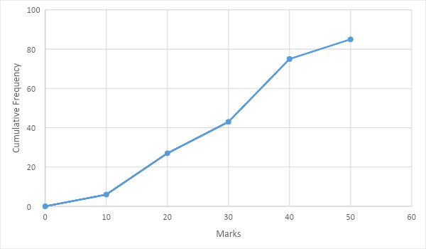
| Class interval | Frequency | Cumulative frequency |
| \[0 - 10\] | 6 | 6 |
| \[10 - 20\] | 21 | 27 |
| \[20 - 30\] | 16 | 43 |
| \[30 - 40\] | 32 | 75 |
| \[40 - 50\] | 10 | 85 |
Now, as we have the values of cumulative frequency at each interval, we can plot a graph between the upper limit of each interval and the cumulative frequency at that class. Remember, the reason why we are plotting the graph with upper limit of the interval is because we are drawing a “less than” type ogive where the cumulative frequency at an interval is less than the upper limit of that interval.
The graph plotted between upper limit of interval and cumulative frequency will be as follows.
This will be the ogive for the given set of data.
Note: If we want to find the median for the data, we can do it by finding the value of x-coordinate when the value of cumulative frequency is half of maximum. By observing the graph, we can easily say that when the cumulative frequency is \[\dfrac{{85}}{2} = 42.5\], then at that point on the graph, the marks will approximately 30, which will be the median for the data given.
Recently Updated Pages
Master Class 12 Economics: Engaging Questions & Answers for Success
Master Class 12 Physics: Engaging Questions & Answers for Success
Master Class 12 English: Engaging Questions & Answers for Success
Master Class 12 Social Science: Engaging Questions & Answers for Success
Master Class 12 Maths: Engaging Questions & Answers for Success
Master Class 12 Business Studies: Engaging Questions & Answers for Success
Trending doubts
Which are the Top 10 Largest Countries of the World?
What are the major means of transport Explain each class 12 social science CBSE
Draw a labelled sketch of the human eye class 12 physics CBSE
Why cannot DNA pass through cell membranes class 12 biology CBSE
Differentiate between insitu conservation and exsitu class 12 biology CBSE
Draw a neat and well labeled diagram of TS of ovary class 12 biology CBSE