


Introduction To Graphs - Exercise-wise Questions and Answers For Class 8 Maths - Free PDF Download
The NCERT Solutions for Class 8 Maths Chapter 13 Introduction To Graphs covers all the chapter's questions (All Exercises) according to the latest CBSE Class 8 Maths Syllabus. This chapter covers the Cartesian plane, plotting points, and different types of graphs such as line graphs, bar graphs, and histograms. It emphasizes the importance of graphs in visualizing and interpreting data, providing practical applications in various fields.
 Table of Content
Class 8 Maths NCERT Solutions introduces the fundamental concepts of graphing, which is a crucial tool for visualizing and interpreting data. Students can download these NCERT Solutions for Maths Class 8 in PDF format for easy and self-paced study. By learning to plot and read graphs, students develop essential skills for analyzing trends, making predictions, and effectively communicating information.
Access Exercise Wise NCERT Solutions for Chapter 13 Maths Class 8
Exercise 13.1: This exercise introduces the Cartesian Plane. The objective is to understand the basics of the Cartesian plane and how to plot points. The Key Concepts are the cartesian coordinate system, identifying and plotting points using (x,y) coordinates, and understanding the x-axis and y-axis.
Exercise 13.2: This exercise explains how to draw and interpret line graphs. Key Concepts are plotting data points on a graph, connecting points to form a line graph, and interpreting trends and patterns from line graphs.
Access NCERT Solutions for Class 8 Maths Chapter 13 – Introduction to Graphs
Exercise 13.1
1: The following graph shows the temperature of a patient in a hospital, recorded every hour.
(a) What was the patient’s temperature at 1 p.m.?
(b) When was the patient’s temperature 38.5°C?
(c) The patient’s temperature was the same two times during the period given. What were these two times?
(d) What was the temperature at 1.30 p.m? How did you arrive at your answer?
(e) During which periods did the patient’s temperature show an upward trend?

Graph ( temperature vs time), Image Credits-NCERT
Ans: (a) The patient's temperature was $36.5{}^\circ C$at $1$ p.m.
(b) At $12$ p.m., the patient's temperature was $38.5{}^\circ C$.
(c) At 1 p.m. and 2 p.m., the patient's temperature was the same.
(d) The graph between $1$ and $2$ p.m. is parallel to the x-axis. At $1$ p.m. and $2$ p.m., the temperature is $36.5{}^\circ C$. So, $1:30$p.m., the temperature is $36.5{}^\circ C$.
(e) The patient's temperature showed an upward trend in the following periods.
$9$ a.m. to $10$ a.m., $10$ a.m. to $11$ a.m., $2$ p.m. to $3$ p.m.
2: The following line graph shows the yearly sales figure for a manufacturing company.
(a) What were the sales in (i) $2002$ (ii) $2006$?
(b) What were the sales in (i) $2003$ (ii) $2005$?
(c) Compute the difference between the sales in $2002$ and $2006$.
(d) In which year was there the greatest difference between the sales as compared to its previous year?

Graph Sales ( in Rs crores ) Vs Years, Image Credits-NCERT
Ans: (a)
(i)The sales in $2002$ were Rs $4$crores.
(ii)The sales in $2006$ were Rs $8$crores.
(b)
(i)The sales in $2003$ were Rs $7$crores.
(ii)The sales in $2005$ were Rs $10$crores.
(c)Difference between the sales in $2002$ and $2006$
= Rs ($8$ − $4$) crores
= Rs $4$ crores
(d)Difference between the sales in $2006$ and $2005$
= Rs ($10$ − $8$) crores
= Rs $2$ crores
Difference between the sales in $2005$ and $2004$
= Rs ($10$ − $6$) crores
= Rs $4$ crores
Difference between the sales in $2004$ and $2003$
= Rs ($7$ − $6$) crores
= Rs $1$ crores
Difference between the sales in $2003$ and $2002$
= Rs ($7$ − $4$) crores
= Rs $3$ crores
As a result, the difference was greatest in $2005$ as compared to the prior year, $2004$.
3: For an experiment in Botany, two different plants, plant A and plant B were grown under similar laboratory conditions. Their heights were measured at the end of each week for $3$ weeks. The results are shown by the following graph.
(a) How high was Plant A after (i) $2$ weeks (ii) $3$weeks?
(b) How high was Plant B after (i) $2$ weeks (ii) $3$weeks?
(c) How much did Plant A grow during the $3rd$ week?
(d) How much did Plant B grow from the end of the $2nd$ week to the end of the $3rd$week?
(e) During which week did Plant A grow most?
(f) During which week did Plant B grow least?
(g) Were the two plants of the same height during any week shown here? Specify.

Graph Height ( in cm ) Vs Weeks, Image Credits-NCERT
Ans: (a) (i)Plant A had grown to a height of $7$ cm after two weeks.
(ii) Plant A grew to a height of $9$ cm after three weeks.
(b) Plant B grew to a height of $7$ cm after two weeks.
(ii) Plant B grew to a height of $10$ cm after three weeks.
(c)Plant A's growth during the third week = $9-7$
= $2$cm
(d)Plant B's growth from the end of the second to the end of the third week
=$10-7$
= $3$cm
(e) Plant A's growth over the first week = $2-0$
= $2$cm
Plant A's growth over the second week = $7-2$
= $5$cm
Plant A's growth during the third week = $9-7$
= $2$cm
As a result, during the second week, plant A grew the most, gaining $5$cm.
(f)Plant B's growth over the first week = $1-0$
= $1$cm
Plant B's growth over the second week = $7-1$
= $6$cm
Plant B's growth during the third week = $10-7$
= $3$cm
As a result, during the first week, plant B grew the least i.e. $1$cm.
(g)The heights of both plants were the same at the conclusion of the second week.
4: The following graph shows the temperature forecast and the actual temperature for each day of a week.
(a) On which days was the forecast temperature the same as the actual temperature?
(b) What was the maximum forecast temperature during the week?
(c) What was the minimum actual temperature during the week?
(d) On which day did the actual temperature differ the most from the forecast temperature?

Graph Temperature Vs Days, Image Credits-NCERT
Ans: (a) On Tuesday, Friday, and Sunday, the forecast temperature matched the actual temperature.
(b)The maximum forecast temperature during the week was $35{}^\circ C$.
(c) The minimum actual temperature during the week was $15{}^\circ C$.
(d)On Thursday, the actual temperature differs the most from the forecast temperature.
5. Use the tables below to draw linear graphs.
(a) The number of days a hill side city received snow in different years.
(b) Population (in thousands) of men and women in a village in different years.
Ans:(a)
The linear graph of the given information can be constructed using the years on the x-axis and the number of days on the y-axis, with scales of $1$ unit = $2$ days on the y-axis and $2$unit = $1$ year on the x-axis.

Graph Days Vs Years
(b)
The linear graph of the given information may be constructed by plotting the years on the x-axis and the population on the y-axis, with scales of $1$ unit = $0.5$ thousand on the y-axis and $2$ unit = $1$ year on the x-axis.

Graph Population(in thousand) Vs Years
6: A courier-person cycles from a town to a neighboring suburban area to deliver a parcel to a merchant. His distance from the town at different times is shown by the following graph.

Graph Distance (in km) Vs Time, Image Credits-NCERT
(a) What is the scale taken for the time axis?
(b) How much time did the person take for the travel?
(c) How far is the place of the merchant from the town?
(d) Did the person stop on his way? Explain.
(e) During which period did he ride fastest?
Ans:
(a) Scale taken for the time axis is $4$ units = $1$ hour
(b) The person travelled between the hours of $8$ a.m. and $11:30$ a.m. As a result, the guy had to travel for $3\frac{1}{2}$ hours.
(c) The merchant is $22$ kilometres away from town.
(d) Yes, from $10$a.m. to $10:30$ a.m., the person came to a halt.
The graph's horizontal portion indicates this.
(e) The graph shows that the person travelled the greatest distance between the hours of $8$ a.m. and $9$ a.m.
As a result, the person's ride was the quickest between $8$ and $9$a.m.
7: Can there be a time temperature graph as follows? Justify you’re answer:
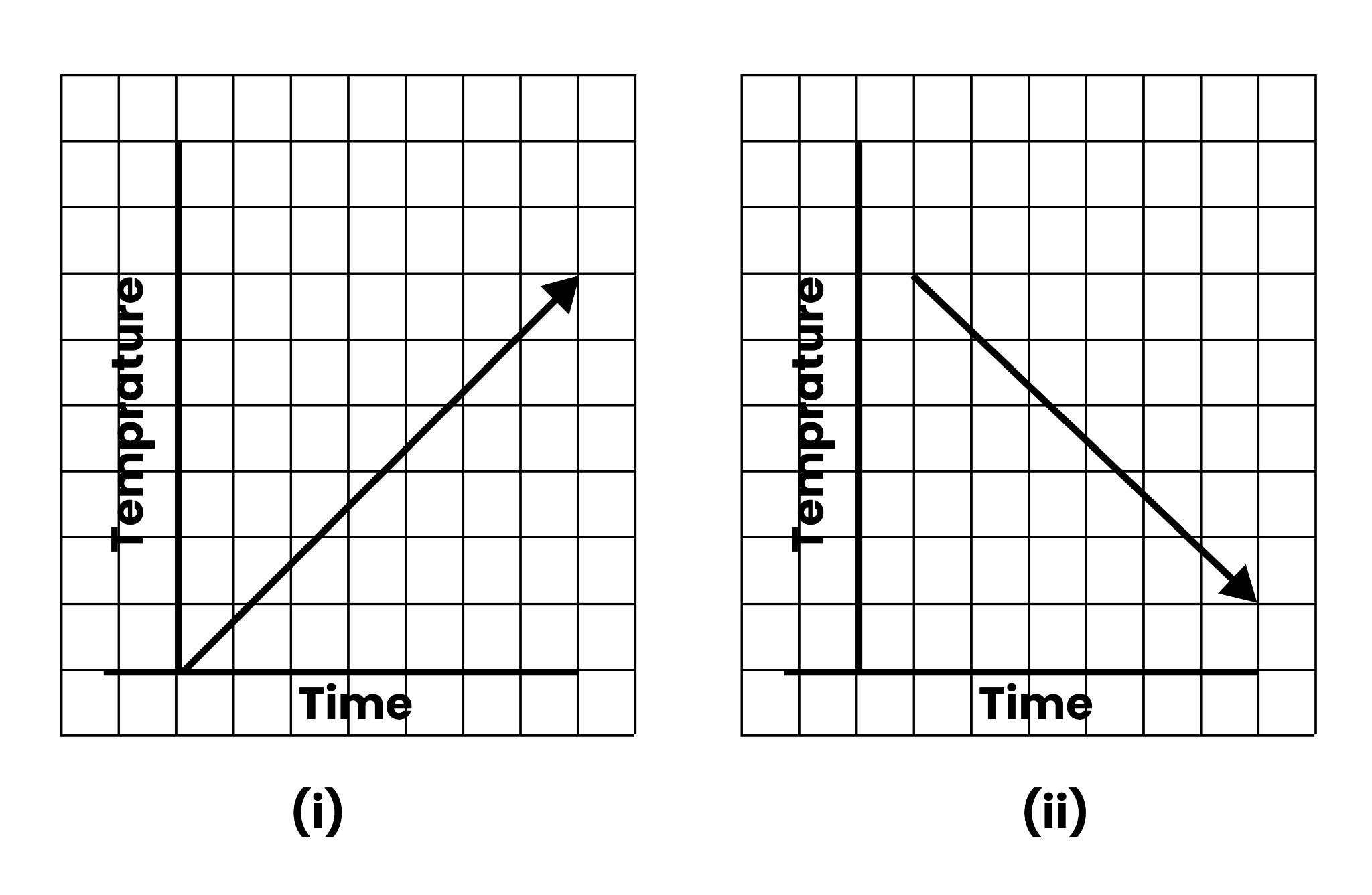
Graph Temperature Vs Time, Image Credits-NCERT
Ans:(i)This might be a time−temperature graph, as the temperature rises with the passage of time.
(ii) This might be a time−temperature graph, as the temperature can drop as time passes.
(iii) This isn't a time−temperature graph because it's impossible to have various temperatures at the same time.
(iv) This can be a time−temperature graph, as the same temperature can be found at different times.
Exercise 13.2
1: Draw the graphs for the following tables of values, with suitable scales on the axes.
(a) Cost of apples
(b) Distance travelled by a car
(i) How much distance did the car cover during the period $7:30$ a.m. to $8$ a.m.?$$
(ii) What was the time when the car had covered a distance of $100$ km since its start?
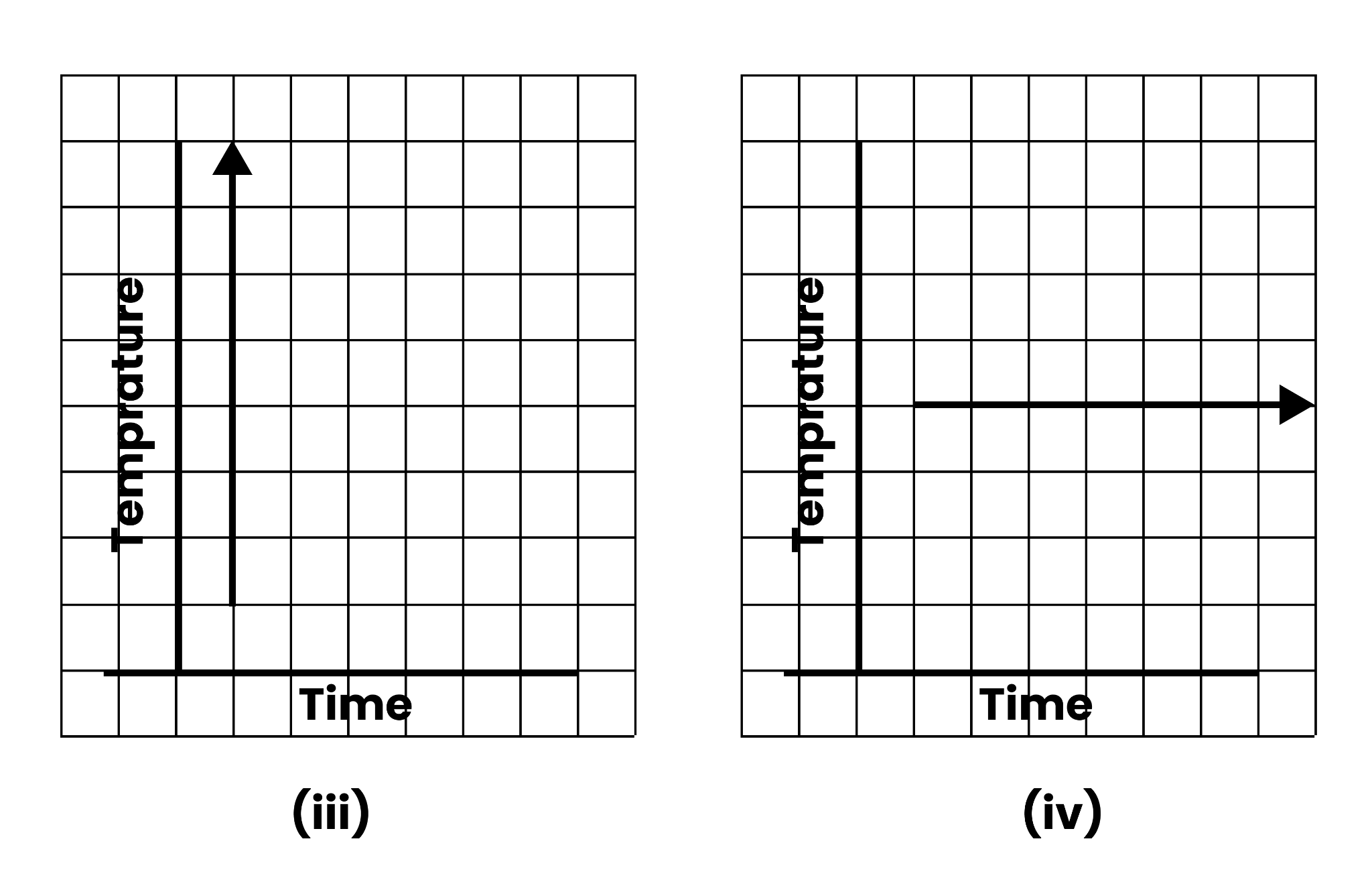
(c) Interest on deposits for a year:
(i) Does the graph pass through the origin?
(ii) Use the graph to find the interest on Rs $2500$ for a year:
(iii) To get an interest of Rs $280$ per year, how much money should be deposited?
Ans: (a) We may mark the quantity of apples on the x-axis and the cost of apples on the y-axis using a suitable scale ($1$ unit = $1$ apple on the x-axis and $1$unit = Rs $5$ on the y-axis).
The following is a graph of the given data.

Graph Cost(Rs) Vs Number of Apples
(b) Using a suitable scale ($2$ units = $1$ hour on the x-axis and $2$ units = $40$ kilometres on the y-axis), we can display the time on the x-axis and the distance travelled by the car on the y-axis.
The following is a graph of the given data.

Graph Distance (km) Vs Time (hours)
(i) The car covered a distance of $20$ kilometres between $7:30$ a.m. and $8$ a.m.
(ii) At $7:30$ a.m., the car had travelled $100$ kilometres since it began.
c) Selecting an appropriate scale
$1$ unit equals Rs $1000$ on the x-axis and Rs $80$ on the y-axis.
On the x-axis, we can represent the deposit, and on the y-axis, we can indicate the interest earned on that account.
The following is a graph of the given data.
Graph Simple Interest Vs Deposit (Rs)
From the graph, the following points can be observed.
(i) Yes. The graph passes through the origin.
(ii) The interest earned in a year on a deposit of Rs $2500$ is Rs $200$.
(iii) To get an interest of Rs $280$ per year, Rs $3500$ should be deposited.
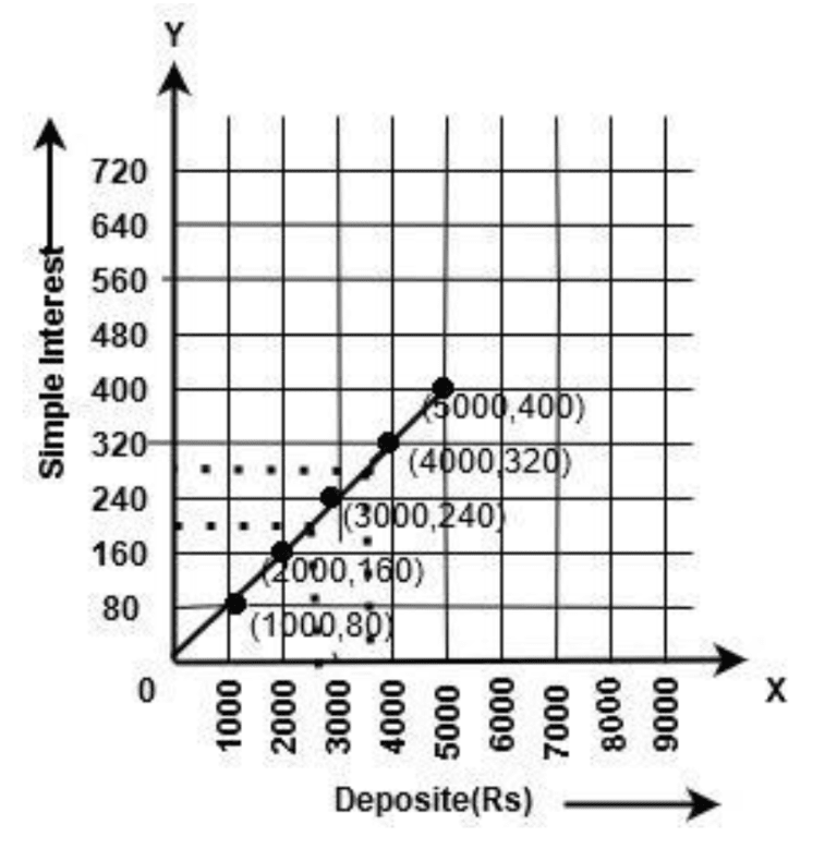
2:Draw a graph for the following.
(i)
Is it a linear graph?
Is it a linear graph?
Ans:(i)Selecting an appropriate scale
$1$ unit equals $1$ cm on the x-axis and $4$ cm on the y-axis.
On the x-axis, we may represent a square's side, and on the y-axis, we can represent the square's perimeter.
The following is a graph of the given data.
Graph Perimeter (cm) Vs Side of Square (cm)
It is a linear graph.
(ii)Selecting an appropriate scale
$1$ unit = $1$ cm on the x-axis and $4$ cm2 on the y-axis
On the x-axis, we may indicate the side of a square, and on the y-axis, we can represent the area of that square.
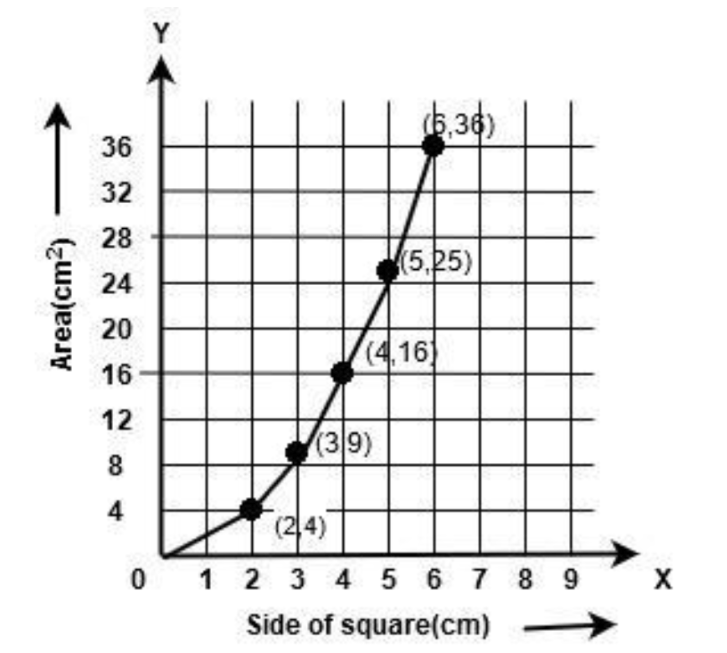
Graph Area (square meter) Vs Side of Square (cm)
The following is a graph of the given data. It is not a linear graph.
Overview of Deleted Syllabus for CBSE Class 8 Maths Introduction to Graphs
Class 8 Maths Chapter 13: Exercises Breakdown
Conclusion
Introduction To Graphs for Class 8 is an essential part of the Maths curriculum. It equips students with essential skills for plotting and interpreting various types of graphs. By mastering the Cartesian plane, understanding different graph types, and applying these concepts to real-world data, students enhance their ability to visualize and analyze information effectively. The chapter's emphasis on practical applications helps students appreciate the relevance of graphs in everyday life, from tracking changes over time to comparing different sets of data. This chapter is significant in exams, with an average of 3-4 questions being asked in previous years.
Other Study Material for CBSE Class 8 Maths Chapter 13
Chapter-Specific NCERT Solutions for Class 8 Maths
Given below are the chapter-wise NCERT Solutions for Class 8 Maths. Go through these chapter-wise solutions to be thoroughly familiar with the concepts.
Important Related Links for CBSE Class 8 Maths

FAQs on NCERT Solutions For Class 8 Maths Chapter 13 Introduction to Graphs (2025-26)
1. What are the main topics covered in NCERT Solutions for Class 8 Maths Chapter 13 Introduction to Graphs?
NCERT Solutions for Class 8 Maths Chapter 13 Introduction to Graphs cover the following core topics as per the CBSE 2025–26 syllabus:
- Plotting points on the Cartesian plane
- Understanding and drawing different types of graphs: line graphs, bar graphs, and histograms
- Interpreting data using graphs
- Identifying trends and patterns with graphical data
- Practical applications and reading real-life data from graphs
2. How do you plot a point on the Cartesian plane as per NCERT Solutions for Class 8 Maths Chapter 13?
To plot a point on the Cartesian plane:
- Identify the x-coordinate (horizontal axis) and the y-coordinate (vertical axis)
- Start from the origin (0,0)
- Move along the x-axis as per the x-value
- From there, move parallel to the y-axis as per the y-value
- Mark the point where these meet
3. What types of questions are solved in Exercise 13.1 of Class 8 Maths Introduction to Graphs?
Exercise 13.1 in NCERT Class 8 Maths Chapter 13 focuses on:
- Basics of the Cartesian plane
- Plotting points using given coordinates
- Recognizing the x-axis and y-axis
- Interpreting simple graphical data
4. Which graphs are introduced in Class 8 Chapter 13, and what are their uses?
Chapter 13 introduces:
- Line graphs – show how data changes over time
- Bar graphs – compare different groups or categories
- Histograms – represent data in intervals for frequency distribution
5. What are the essential elements to include when drawing a graph as per the CBSE Class 8 Maths syllabus?
According to CBSE guidelines, a correct graph must have:
- Labeled axes (with quantities and measuring units)
- Title describing the experiment or representation
- Scale marked clearly for both axes
- Grid lines and data points arranged properly
- A best-fitted line if required
- Graphs should fill the allotted space neatly
6. How can students avoid mistakes when interpreting questions on graphs in CBSE Class 8 exams?
To avoid common errors:
- Always double-check axis labels and scales
- Read the question carefully to understand what is being asked (e.g., time, value, interval)
- Locate and interpret points accurately on the graph
- Use the provided units
- Write exact values wherever required and avoid assumptions
7. What is the significance of the origin on a Cartesian plane in NCERT Solutions for Class 8 Maths Chapter 13?
The origin is the intersection point of the x-axis and y-axis, denoted by (0,0). It serves as the reference for plotting all other points, making it crucial for interpreting any graph or plotting data accurately.
8. In what ways are graphs applied in real life according to Class 8 Introduction to Graphs?
Graphs are used to:
- Track temperature and weather changes
- Represent sales, profits, or losses over time
- Display population growth or decline
- Summarize sports scores or scientific experiment data
9. How should students select an appropriate scale when drawing graphs in Class 8 Maths?
Choosing the right scale involves:
- Identifying the range of data for both axes
- Ensuring data fits comfortably within the allotted graph paper space
- Keeping scales simple and consistent for easy plotting and comparison
- Example: If values are from 0 to 40, use intervals of 5 or 10 for clarity
10. What are linear graphs and how are they different from non-linear graphs in Chapter 13?
Linear graphs are graphs that consist of points joined by a straight line, indicating a constant rate of change. Non-linear graphs will curve, showing variable rates of change. Students learn to differentiate and interpret both types as per the Class 8 CBSE syllabus.
11. Why is understanding the x-axis and y-axis fundamental for Class 8 students learning graphs?
Understanding axes is fundamental because:
- The x-axis typically represents independent variables (like time)
- The y-axis shows dependent variables (like temperature, sales, or scores)
- All plotting and reading of points depends on correct axis interpretation
12. What are the steps provided in NCERT Solutions for solving a question involving reading data from a line graph?
The standard steps are:
- Study the graph and identify axis labels and scales
- Locate the given data value on the correct axis
- Trace horizontally or vertically to intersecting points as needed
- Read the corresponding value on the other axis
- Write the answer using the correct units and values
13. How do NCERT Solutions for Class 8 Maths Chapter 13 support CBSE exam preparation?
They ensure exam-readiness by:
- Providing step-by-step, CBSE-marking scheme aligned solutions
- Emphasizing correct methodology and units
- Including all question types found in textbooks and previous exams
- Covering skipped logic, what-if variations, and reasoning behind each step
14. What is a histogram and how is it represented in the Class 8 Introduction to Graphs Chapter?
Histograms are bar-like graphs that show the frequency of data within certain intervals or ranges (frequency distribution). Unlike bar graphs, their bars touch each other. They help in understanding the spread of data over a continuous interval, a key focus in CBSE Class 8 graphs solutions.
15. How are CBSE deleted topics for Chapter 13 handled in updated NCERT Solutions?
Any topics removed from the official 2025–26 CBSE syllabus (such as Pie graphs or specific advanced sub-topics) are excluded in the latest revised solutions. Solutions now focus only on the retained parts: plotting, line graphs, bar graphs, histograms, and reading/interpreting graphs.