Courses
Courses for Kids
Free study material
Offline Centres
More
Store Icon
Store

NCERT Solutions Class 8 Maths Chapter 13 Introduction to Graphs

ffImage

NCERT Solutions for Chapter 13 Maths Class 8 Introduction To Graphs - FREE PDF Download

The NCERT Solutions for Class 8 Maths Chapter 13 Introduction To Graphs covers all the chapter's questions (All Exercises) according to the latest CBSE Class 8 Maths Syllabus. This chapter covers the Cartesian plane, plotting points, and different types of graphs such as line graphs, bar graphs, and histograms. It emphasizes the importance of graphs in visualizing and interpreting data, providing practical applications in various fields.

toc-symbol
Table of Content
1. NCERT Solutions for Chapter 13 Maths Class 8 Introduction To Graphs - FREE PDF Download
2. Glance on Maths Chapter 13 Class 8 - Introduction to Graphs
3. Access Exercise Wise NCERT Solutions for Chapter 13 Maths Class 8
4. Exercises Under NCERT Solutions for Class 8 Maths Chapter 13 Introduction to Graphs
5. Access NCERT Solutions for Class 8 Maths Chapter 13 – Introduction to Graphs
    5.1Exercise 13.1
    5.2Exercise 13.2
6. Overview of Deleted Syllabus for CBSE Class 8 Maths Introduction to Graphs
7. Class 8 Maths Chapter 13: Exercises Breakdown
8. Other Study Material for CBSE Class 8 Maths Chapter 13
9. Chapter-Specific NCERT Solutions for Class 8 Maths
FAQs


Class 8 Maths NCERT Solutions introduces the fundamental concepts of graphing, which is a crucial tool for visualizing and interpreting data. Students can download these NCERT Solutions for Maths Class 8 in PDF format for easy and self-paced study. By learning to plot and read graphs, students develop essential skills for analyzing trends, making predictions, and effectively communicating information.


Glance on Maths Chapter 13 Class 8 - Introduction to Graphs

  • Chapter 13 of Class 8 Maths provides a comprehensive understanding of different types of graphs and their applications.

  • The chapter begins with an introduction to the Cartesian plane, including the x-axis and y-axis, and how to plot points on this plane.

  • Different types of graphs are explored in detail, such as line graphs, bar graphs, and histograms. Each type of graph has its unique applications and advantages in representing specific kinds of data.

  • The Chapter explains how to plot points using given coordinates and understand the significance of each point on the graph. 

  • This article contains chapter notes, important questions, exemplar solutions, exercises, and video links for Chapter 13 - Introduction To Graphs, which you can download as PDFs.

  • There are two exercises (9 fully solved questions) in class 8th maths chapter 13 Introduction To Graphs.


Access Exercise Wise NCERT Solutions for Chapter 13 Maths Class 8

Exercises Under NCERT Solutions for Class 8 Maths Chapter 13 Introduction to Graphs

  • Exercise 13.1: This exercise introduces the Cartesian Plane. The objective is to understand the basics of the Cartesian plane and how to plot points. The Key Concepts are the cartesian coordinate system, identifying and plotting points using (x,y) coordinates, and understanding the x-axis and y-axis.

  • Exercise 13.2: This exercise explains how to draw and interpret line graphs. Key Concepts are plotting data points on a graph, connecting points to form a line graph, and interpreting trends and patterns from line graphs.

Access NCERT Solutions for Class 8 Maths Chapter 13 – Introduction to Graphs

Exercise 13.1

1: The following graph shows the temperature of a patient in a hospital, recorded every hour. 

(a) What was the patient’s temperature at 1 p.m.? 

(b) When was the patient’s temperature 38.5°C? 

(c) The patient’s temperature was the same two times during the period given. What were these two times? 

(d) What was the temperature at 1.30 p.m? How did you arrive at your answer? 

(e) During which periods did the patient’s temperature show an upward trend?


Graph ( temperature vs time), Image Credits-NCERT


Graph ( temperature vs time), Image Credits-NCERT


Ans: (a) The patient's temperature was $36.5{}^\circ C$at $1$ p.m.

(b) At $12$ p.m., the patient's temperature was $38.5{}^\circ C$.

(c) At 1 p.m. and 2 p.m., the patient's temperature was the same.

(d) The graph between $1$ and $2$ p.m. is parallel to the x-axis. At $1$ p.m. and $2$ p.m., the temperature is $36.5{}^\circ C$. So, $1:30$p.m., the temperature is $36.5{}^\circ C$.

(e) The patient's temperature showed an upward trend in the following periods.


$9$ a.m. to $10$ a.m., $10$ a.m. to $11$ a.m., $2$ p.m. to $3$ p.m.


2: The following line graph shows the yearly sales figure for a manufacturing company. 

(a) What were the sales in (i) $2002$ (ii) $2006$? 

(b) What were the sales in (i) $2003$ (ii) $2005$? 

(c) Compute the difference between the sales in $2002$ and $2006$. 

(d) In which year was there the greatest difference between the sales as compared to its previous year?


Graph Sales ( in Rs crores ) Vs Years, Image Credits-NCERT


Graph Sales ( in Rs crores ) Vs Years, Image Credits-NCERT

Ans: (a) 

(i)The sales in $2002$ were Rs $4$crores.

(ii)The sales in $2006$ were Rs $8$crores.


(b)

(i)The sales in $2003$ were Rs $7$crores.

(ii)The sales in $2005$ were Rs $10$crores.


(c)Difference between the sales in $2002$ and $2006$

= Rs ($8$ − $4$) crores

 = Rs $4$ crores 


(d)Difference between the sales in $2006$ and $2005$

= Rs ($10$ − $8$) crores

 = Rs $2$ crores 


Difference between the sales in $2005$ and $2004$

= Rs ($10$ − $6$) crores

 = Rs $4$ crores 


Difference between the sales in $2004$ and $2003$

= Rs ($7$ − $6$) crores

 = Rs $1$ crores 


Difference between the sales in $2003$ and $2002$

= Rs ($7$ − $4$) crores

 = Rs $3$ crores 


As a result, the difference was greatest in $2005$ as compared to the prior year, $2004$.


3: For an experiment in Botany, two different plants, plant A and plant B were grown under similar laboratory conditions. Their heights were measured at the end of each week for $3$ weeks. The results are shown by the following graph. 

(a) How high was Plant A after (i) $2$ weeks (ii) $3$weeks? 

(b) How high was Plant B after (i) $2$ weeks (ii) $3$weeks? 

(c) How much did Plant A grow during the $3rd$ week?

(d) How much did Plant B grow from the end of the $2nd$ week to the end of the $3rd$week? 

(e) During which week did Plant A grow most? 

(f) During which week did Plant B grow least? 

(g) Were the two plants of the same height during any week shown here? Specify.


Graph Height ( in cm ) Vs Weeks, Image Credits-NCERT


Graph Height ( in cm ) Vs Weeks, Image Credits-NCERT


Ans: (a) (i)Plant A had grown to a height of $7$ cm after two weeks.

(ii) Plant A grew to a height of $9$ cm after three weeks.


(b) Plant B grew to a height of $7$ cm after two weeks.

(ii) Plant B grew to a height of $10$ cm after three weeks.


(c)Plant A's growth during the third week = $9-7$ 

= $2$cm


(d)Plant B's growth from the end of the second to the end of the third week 

=$10-7$ 

= $3$cm


(e) Plant A's growth over the first week = $2-0$ 

= $2$cm

Plant A's growth over the second week = $7-2$

= $5$cm

Plant A's growth during the third week = $9-7$

= $2$cm

As a result, during the second week, plant A grew the most, gaining $5$cm.


(f)Plant B's growth over the first week = $1-0$ 

= $1$cm

Plant B's growth over the second week = $7-1$

= $6$cm

Plant B's growth during the third week = $10-7$

= $3$cm

As a result, during the first week, plant B grew the least i.e. $1$cm.


(g)The heights of both plants were the same at the conclusion of the second week.


4: The following graph shows the temperature forecast and the actual temperature for each day of a week. 

(a) On which days was the forecast temperature the same as the actual temperature? 

(b) What was the maximum forecast temperature during the week? 

(c) What was the minimum actual temperature during the week? 

(d) On which day did the actual temperature differ the most from the forecast temperature? 


Graph Temperature  Vs Days, Image Credits-NCERT


Graph Temperature  Vs Days, Image Credits-NCERT


Ans: (a) On Tuesday, Friday, and Sunday, the forecast temperature matched the actual temperature.

(b)The maximum forecast temperature during the week was $35{}^\circ C$. 

(c) The minimum actual temperature during the week was $15{}^\circ C$.

(d)On Thursday, the actual temperature differs the most from the forecast temperature. 


5. Use the tables below to draw linear graphs. 
(a) The number of days a hill side city received snow in different years.


Year

$2003$

$2004$

$2005$

$2006$

Days

$8$

$10$

$5$

$12$


(b) Population (in thousands) of men and women in a village in different years.


Year

$2003$

$2004$

$2005$

$2006$

$2007$

Number of men  

$12$

$12.5$

$13$

$13.2$

$13.5$

Number of women  

$11.3$

$11.9$

$13$

$13.6$

$12.8$


Ans:(a)

The linear graph of the given information can be constructed using the years on the x-axis and the number of days on the y-axis, with scales of $1$ unit = $2$ days on the y-axis and $2$unit = $1$ year on the x-axis. 


Graph Days  Vs Years


Graph Days  Vs Years


(b)

The linear graph of the given information may be constructed by plotting the years on the x-axis and the population on the y-axis, with scales of $1$ unit = $0.5$ thousand on the y-axis and $2$ unit = $1$ year on the x-axis.


Graph Population(in thousand) Vs Years


Graph Population(in thousand) Vs Years


6: A courier-person cycles from a town to a neighboring suburban area to deliver a parcel to a merchant. His distance from the town at different times is shown by the following graph. 


Graph Distance (in km)  Vs Time, Image Credits-NCERT


Graph Distance (in km)  Vs Time, Image Credits-NCERT


(a) What is the scale taken for the time axis? 

(b) How much time did the person take for the travel? 

(c) How far is the place of the merchant from the town? 

(d) Did the person stop on his way? Explain. 

(e) During which period did he ride fastest? 


Ans:

(a) Scale taken for the time axis is $4$ units = $1$ hour
(b) The person travelled between the hours of $8$ a.m. and $11:30$ a.m. As a result, the guy had to travel for $3\frac{1}{2}$  hours. 

(c) The merchant is $22$ kilometres away from town. 

(d) Yes, from $10$a.m. to $10:30$ a.m., the person came to a halt. 

The graph's horizontal portion indicates this. 

(e) The graph shows that the person travelled the greatest distance between the hours of $8$ a.m. and $9$ a.m. 

As a result, the person's ride was the quickest between $8$ and $9$a.m. 


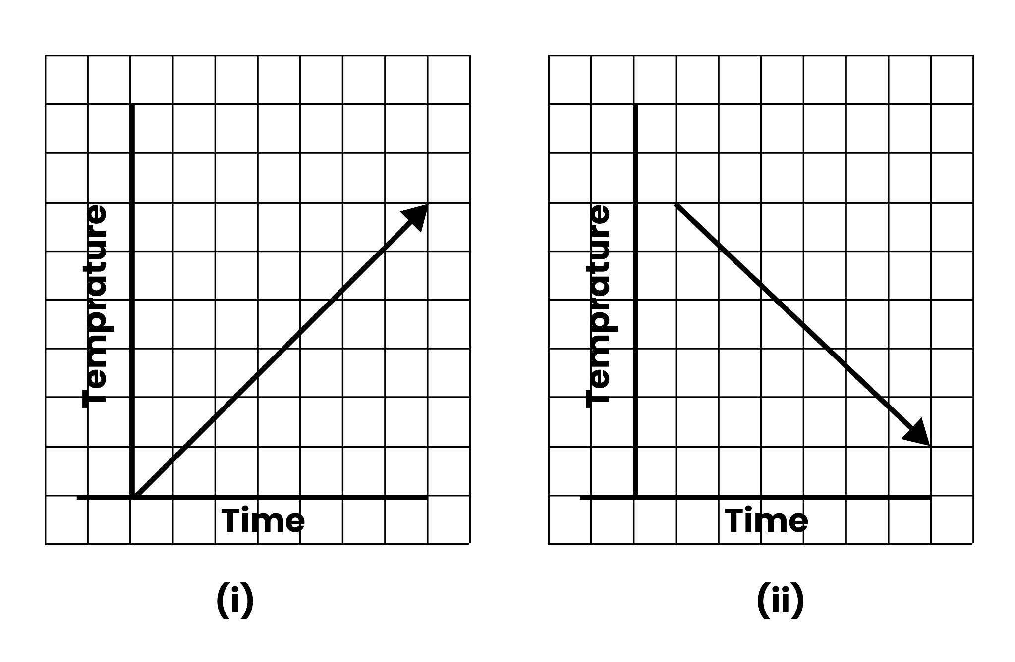
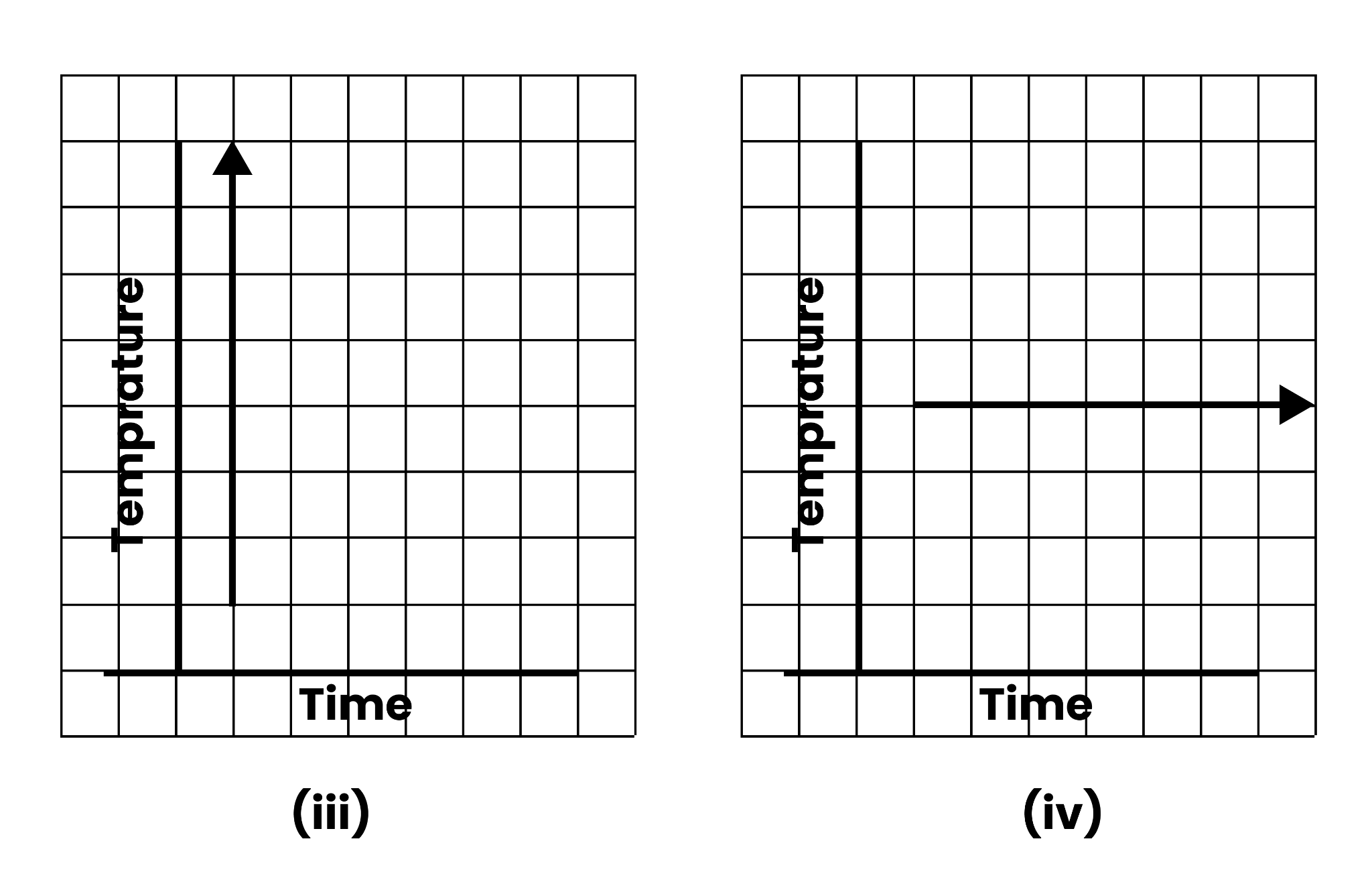
 7: Can there be a time temperature graph as follows? Justify you’re answer: 


Graph Temperature Vs Time, Image Credits-NCERT

Graph Temperature Vs Time, Image Credits-NCERT 2


Graph Temperature Vs Time, Image Credits-NCERT


Ans:(i)This might be a time−temperature graph, as the temperature rises with the passage of time. 

(ii) This might be a time−temperature graph, as the temperature can drop as time passes. 

(iii) This isn't a time−temperature graph because it's impossible to have various temperatures at the same time. 

(iv) This can be a time−temperature graph, as the same temperature can be found at different times. 


Exercise 13.2

1: Draw the graphs for the following tables of values, with suitable scales on the axes. 

(a) Cost of apples 


Number of apples

$1$

$2$

$3$

$4$

$5$

Cost(in Rs)

$5$

$10$

$15$

$20$

$25$


(b) Distance travelled by a car 


Time(in hours)

$6a.m.$

$7a.m.$

$8a.m.$

$9a.m.$

Distance(in km)

$40$

$80$

$120$

$160$


(i) How much distance did the car cover during the period $7:30$  a.m. to $8$ a.m.?$$ 

(ii) What was the time when the car had covered a distance of $100$ km since its start?

(c) Interest on deposits for a year: 


Deposit(in Rs)

$1000$

$2000$

$3000$

$4000$

$5000$

Simple interest (in Rs)

$80$

$160$

$240$

$320$

$400$


(i) Does the graph pass through the origin? 

(ii) Use the graph to find the interest on Rs $2500$ for a year: 

(iii) To get an interest of Rs $280$ per year, how much money should be deposited? 


Ans: (a)  We may mark the quantity of apples on the x-axis and the cost of apples on the y-axis using a suitable scale ($1$ unit = $1$ apple on the x-axis and $1$unit = Rs $5$ on the y-axis).


The following is a graph of the given data.


Graph Cost(Rs) Vs Number of Apples


Graph Cost(Rs) Vs Number of Apples


(b) Using a suitable scale ($2$ units = $1$ hour on the x-axis and $2$ units = $40$ kilometres on the y-axis), we can display the time on the x-axis and the distance travelled by the car on the y-axis.


The following is a graph of the given data.


Graph Distance (km) Vs Time (hours)


Graph Distance (km) Vs Time (hours)


(i) The car covered a distance of $20$ kilometres between $7:30$ a.m. and $8$ a.m.

(ii) At $7:30$ a.m., the car had travelled $100$ kilometres since it began.


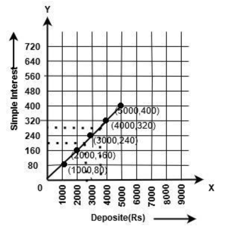
c) Selecting an appropriate scale

$1$ unit equals Rs $1000$ on the x-axis and Rs $80$ on the y-axis.

On the x-axis, we can represent the deposit, and on the y-axis, we can indicate the interest earned on that account.

The following is a graph of the given data. 


Graph Simple Interest Vs Deposit (Rs)


Graph Simple Interest Vs Deposit (Rs)


From the graph, the following points can be observed. 

(i) Yes. The graph passes through the origin. 

(ii) The interest earned in a year on a deposit of Rs $2500$ is Rs $200$. 

(iii) To get an interest of Rs $280$ per year, Rs $3500$ should be deposited. 


2:Draw a graph for the following. 

(i) 


Side of square(in cm)

$2$

$3$

$3.5$

$5$

$6$

Perimeter

$8$

$12$

$14$

$20$

$24$


Is it a linear graph? 


Side of square(in cm)

$2$

$3$

$4$

$5$

$6$

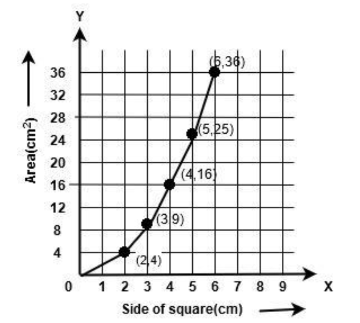
Area(in cm2)

$4$

$9$

$16$

$25$

$36$


Is it a linear graph? 

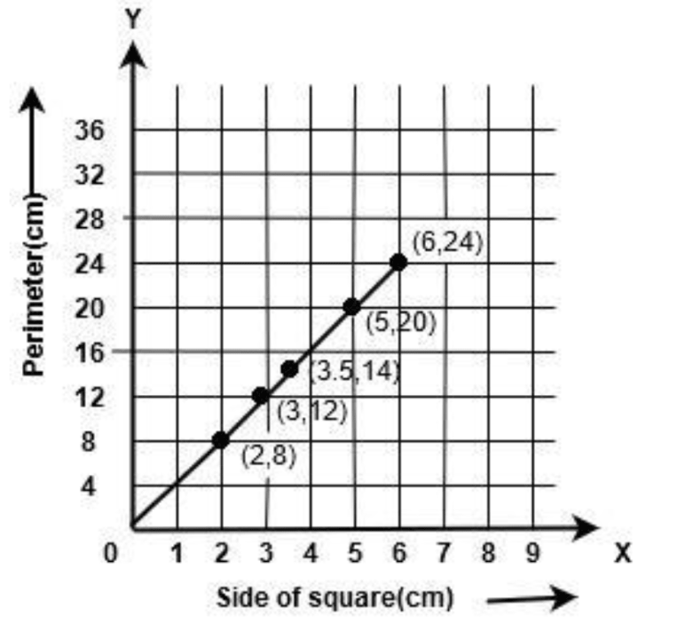
Ans:(i)Selecting an appropriate scale

$1$ unit equals $1$ cm on the x-axis and $4$ cm on the y-axis.

On the x-axis, we may represent a square's side, and on the y-axis, we can represent the square's perimeter.

The following is a graph of the given data.


Graph Perimeter (cm) Vs Side of Square (cm)


Graph Perimeter (cm) Vs Side of Square (cm)


It is a linear graph.

(ii)Selecting an appropriate scale

$1$ unit = $1$ cm on the x-axis and $4$ cm2 on the y-axis

On the x-axis, we may indicate the side of a square, and on the y-axis, we can represent the area of that square.


Graph Area (square meter) Vs Side of Square (cm)


Graph Area (square meter) Vs Side of Square (cm)


The following is a graph of the given data. It is not a linear graph.


Overview of Deleted Syllabus for CBSE Class 8 Maths Introduction to Graphs

Chapter

Dropped Topics

Introduction to Graphs

15.1.1 A bar graph

15.1.2 A Pie graph

15.1.3 A histogram

15.2 Linear Graphs

15.2.1 Location of a point

15.2.2 Coordinates


Class 8 Maths Chapter 13: Exercises Breakdown

Exercise

Number of Questions

Exercise 13.1

7 Questions & Solutions

Exercise 13.2

2 Questions & Solutions


Conclusion

Introduction To Graphs for Class 8 is an essential part of the Maths curriculum. It equips students with essential skills for plotting and interpreting various types of graphs. By mastering the Cartesian plane, understanding different graph types, and applying these concepts to real-world data, students enhance their ability to visualize and analyze information effectively. The chapter's emphasis on practical applications helps students appreciate the relevance of graphs in everyday life, from tracking changes over time to comparing different sets of data. This chapter is significant in exams, with an average of 3-4 questions being asked in previous years.


Other Study Material for CBSE Class 8 Maths Chapter 13


Chapter-Specific NCERT Solutions for Class 8 Maths

Given below are the chapter-wise NCERT Solutions for Class 8 Maths. Go through these chapter-wise solutions to be thoroughly familiar with the concepts.


Important Related Links for CBSE Class 8 Maths

FAQs on NCERT Solutions Class 8 Maths Chapter 13 Introduction to Graphs

1. What are the five essential things that a graph needs?

There are five important things that students should keep in mind while drawing a graph, and they are:

  • Axes and Background

  • Grid lines

  • Visual structures

  • Scales and tick marks

  • Text

2. What are the crucial elements of a useful graph?

Among different important elements, five principal features are explained below:

  • The experiment which describes the title

  • The graphical representation should fill the space allocated for the graph

  • Every data point should be arranged in a proper position

  • Each axes should be categorised with the measured quantity and the measuring units

  • A best-fitted line is required

3. What is a useful chart?

To make comparisons, Bar charts are the best option, whereas line charts are good for trends. For relationships and distribution, Scatter plot charts work better, but Pie charts are only utilised for compositions, not for any comparisons or distributions.

4. Where can I download the latest NCERT Solutions for Chapter 15 “Introduction to Graphs” of Class 8 Maths? 

To download Vedantu's NCERT Solutions for Chapter 15 of Class 8 Maths  follow these direct steps:

  • Visit the page NCERT Solutions for Chapter 15 of Class 8 Maths. 

  • Scroll down and click on the option to "Download PDF."

  • The subsequent page will open that carries the link to download the PDF automatically.

These solutions are regularly updated as per the CBSE guidelines and syllabus. Hence, these are the latest solutions you can find online. Moreover, they are available to be downloaded free of charge.

5. Does Vedantu provide answers to all the questions of Chapter 15 “Introduction to Graphs” of Class 8 Maths?

In Chapter 15  "Introduction to Graphs," there are three exercises in total. Vedantu provides detailed answers to each question of these exercises. The solutions are explained step by step with graphs wherever required.  Vedantu's NCERT Solutions for Class 8 Chapter 15 "Introduction to Graphs" provide solutions that are well suited for examinations.  These are prepared after a painstaking process by our experts and hence are reliable. Moreover, Vedantu provides additional explanations of the chapter's concepts to allow students to comprehend the chapter better. These solutions are available free of cost on the Vedantu website and the Vedantu app.

6. How many types of graphs are there in Chapter 15 “Introduction to Graphs” of Class 8 Maths?

Chapter 15 "Introduction to Graphs" teaches the students the basic types and functions of graphs. The various types of graphs introduced in this chapter are as follows:

  • Bar graphs: to compare various categorical data

  • Histograms: to represent data in intervals

  • Pie graphs: to compare parts of a whole

  • Line graphs:  to show continuous change over a certain duration

  • Linear graphs: a whole unbroken line graph

These graphs have several real-time applications, and thus students should pay close attention to this chapter.

7. How do you draw a linear graph?

To draw a linear graph, concepts of plotting points on graph paper, coordinates, and location of points must be clear in your mind.

  • Choose a suitable scale for the x and y-axis.

  • Mark the required quantities accordingly on the x and y-axis.

  • As per the quantities given in the question, plot the points on the graph.

  • Join the plotted points. This should provide you with a straight line on the graph.

8. Why do we use graphs according to Chapter 15 of Class 8 Maths?

Graphs have infinite uses in our lives. They are used for visually representing accurate data for various purposes. Such a graphical representation of collected data is convenient to comprehend.  Graphs can easily represent large quantities that might be difficult to display in text.


You might have often come across various graphs on news channels, magazines, newspapers, etc.  They can be used to depict temperature and weather changes, display annual reports, profits, losses, scores in sports, etc.

9. What is the basic introduction to graphs in Class 8?

In class 8 introduction to graphs, graphs are visual representations of data that show the relationship between different sets of information. They help in understanding and interpreting data quickly and easily. In Class 8, students learn about plotting points on the Cartesian plane and various types of graphs used to represent data.

10. How many types of graphs are there in Maths Class 8 introduction to graphs?

In the class 8 maths chapter introduction to graphs, there are several types of graphs, including:

  • Line Graphs: Used to show trends over time.

  • Bar Graphs: Used to compare quantities across different categories.

  • Histograms: Used to represent the distribution of data over a continuous interval.

  • Pie Charts: Used to show proportions of a whole.

  • Scatter Plots: Used to show the relationship between two variables.

11. Who introduced graphs in the class 8 maths chapter introduction to graphs?

Graphs discussed in class 8 maths chapter introduction to graphs were introduced by the Scottish mathematician William Playfair in the late 18th century. He is credited with inventing several types of graphs, including the line graph, bar graph, and pie chart, which are commonly used today.

12. What is the origin of the graph in the introduction to Graphs class 8 pdf solutions?

The origin in a graph is the point where the x-axis and y-axis intersect. It is denoted by the coordinates (0,0)(0, 0)(0,0) and serves as the reference point for plotting other points on the Cartesian plane.

13. What is a line graph in the introduction of graph class 8?

A line graph shown in the introduction of Graph Class 8 is a type of graph used to display information that changes over time. It consists of points plotted on the graph that are connected by straight lines. Line graphs are useful for showing trends and patterns in data.

14. What are graphs class 8 introduction to graphs?

In the introduction to Graphs class 8 pdf solutions, graphs are introduced as tools for representing data visually. Students learn about different types of graphs, how to plot points on the Cartesian plane, and how to interpret data from graphs. Graphs in Introduction to Graphs Class 8 pdf solutions introduction to graphs help in understanding the relationship between variables and making data-driven decisions.
15. What is an example of a graph mentioned in the introduction to graphs class 8?
An example of a graph in Introduction to Graphs class 8, is a line graph showing the temperature changes over a week. The x-axis represents the days of the week, and the y-axis represents the temperature. Points are plotted for each day's temperature and connected by lines to show the trend over the week.