


Pie charts are used to compare data in ___________
(a) perpendicular
(b) rational
(c) proportion
(d) only frequencies
Answer
578.7k+ views
Hint:
A pie chart is that it will compare the relative sizes of the given data . In this chart we did not require the frequencies of data. If we have a percentage of that data we will draw that graph and compare the values.
Complete step by step solution:
A Pie Chart is a special chart that uses pie slices to show relative sizes of data
For example if we want to visualization of the data of pet owners in a particular locality and the data will given in percentage as
DOGS : $55\% $
CATS : $30\% $
FISH : $6\% $
RABBITS : $5\% $
RODENTS : $4\% $
So the pie charts of the given data is
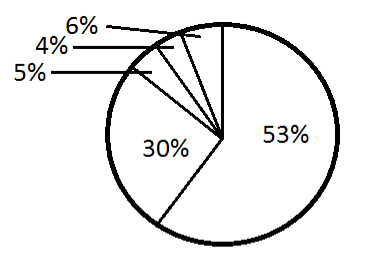
Angle is obtained by the percentage of pet $ \times $ $360^\circ $. So, according to this we will see that the proportion of the pets in a locality or it will compare the variety of pets in the locality and their amount so the most preferable option is C that is proportion.
C will be the correct answer.
Note:
There are many types of chart for example pie chart , Bar chart ,Line chart , Area chart etc
For comparing the frequencies of the given data we will use the Bar Charts for example if we have to compare that Runs scored by a batsmen in the following years so we make the bar chart of the Batsman runs vs. year from here we will compare easily .
A line chart is a graphical representation of an asset's historical price action that connects a series of data points with a continuous line.
A pie chart is that it will compare the relative sizes of the given data . In this chart we did not require the frequencies of data. If we have a percentage of that data we will draw that graph and compare the values.
Complete step by step solution:
A Pie Chart is a special chart that uses pie slices to show relative sizes of data
For example if we want to visualization of the data of pet owners in a particular locality and the data will given in percentage as
DOGS : $55\% $
CATS : $30\% $
FISH : $6\% $
RABBITS : $5\% $
RODENTS : $4\% $
So the pie charts of the given data is
Angle is obtained by the percentage of pet $ \times $ $360^\circ $. So, according to this we will see that the proportion of the pets in a locality or it will compare the variety of pets in the locality and their amount so the most preferable option is C that is proportion.
C will be the correct answer.
Note:
There are many types of chart for example pie chart , Bar chart ,Line chart , Area chart etc
For comparing the frequencies of the given data we will use the Bar Charts for example if we have to compare that Runs scored by a batsmen in the following years so we make the bar chart of the Batsman runs vs. year from here we will compare easily .
A line chart is a graphical representation of an asset's historical price action that connects a series of data points with a continuous line.
Recently Updated Pages
Master Class 10 Computer Science: Engaging Questions & Answers for Success
Master Class 10 General Knowledge: Engaging Questions & Answers for Success
Master Class 10 English: Engaging Questions & Answers for Success
Master Class 10 Social Science: Engaging Questions & Answers for Success
Master Class 10 Maths: Engaging Questions & Answers for Success
Master Class 10 Science: Engaging Questions & Answers for Success
Trending doubts
What is the median of the first 10 natural numbers class 10 maths CBSE
Which women's tennis player has 24 Grand Slam singles titles?
Who is the Brand Ambassador of Incredible India?
Why is there a time difference of about 5 hours between class 10 social science CBSE
Write a letter to the principal requesting him to grant class 10 english CBSE
A moving boat is observed from the top of a 150 m high class 10 maths CBSE