


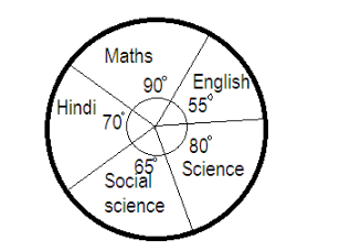
The given pie chart shows the marks scored by a student in five different English, hindi, mathematics, science and social science. Assuming that the total marks obtained for the examination are 540. Find the subject in which the student scored 22.2% marks?
A. Hindi
B. science
C. social science
D. English
Answer
575.4k+ views
Hint: Generally we are given with the information in the form of numerical figures which is used to find out things and to make decisions which we term as data. This data can be represented effectively by the use of graphs and charts. One of the effective ways can be seen above: we have been given a circle graph depicting the area of marks obtained for each of the subjects.
Complete step-by-step answer:
Now let us find the marks obtained in each subject by the student in the given pie chart. We know that the sum of all angles at the centre of the circle is 360 degrees.
Total marks obtained=540
Since we have been given the angle of the area for the marks obtained in each subject which sums up to 360, then
Marks obtained in mathematics = $ \dfrac{{90}}{{360}} \times 540 = \dfrac{1}{4} \times 540 = 135 $ marks
The percentage that the 135 marks of mathematics make out of 540 can be calculated by
$ \Rightarrow \dfrac{{135}}{{540}} \times 100 = \dfrac{{135 \times 2}}{{27}} = 25\% $
Marks obtained in social science= $ \dfrac{{65}}{{360}} \times 540 = 65 \times \dfrac{3}{2} = 97.5 $ marks
The percentage that the 97.5 marks of social science make out of 540 can be calculated by
$ \Rightarrow \dfrac{{97.5}}{{540}} \times 100 = \dfrac{{975}}{{54}} = 18.05\% $
Marks obtained in English= $ \dfrac{{55}}{{360}} \times 540 = \dfrac{{55 \times 3}}{2} = 82.5 $ marks
The percentage that the 82.5 marks of english make out of 540 can be calculated by
$ \Rightarrow \dfrac{{82.5}}{{540}} \times 100 = \dfrac{{82.5 \times 5}}{{27}} = 15.2\% $
The marks obtained in hindi= $ \dfrac{{70}}{{360}} \times 540 = \dfrac{{70 \times 3}}{2} = 105 $ marks
The percentage that the 105 marks of hindi make out of 540 can be calculated by
$ \Rightarrow \dfrac{{105}}{{540}} \times 100 = \dfrac{{105 \times 2}}{{27}} = 19.4\% $
The marks obtained in science= $ \dfrac{{80}}{{360}} \times 540 = \dfrac{{80 \times 3}}{2} = 120 $ marks
The percentage that the 120 marks of science make out of 540 can be calculated by
$ \dfrac{{120}}{{540}} \times 100 = 22.2\% $
So, the correct answer is “Option B”.
Note: Circle graphs also called as pie charts, are a type of graph used to represent a part of the whole relationship. They are used to compare different parts of a whole document. The entire circle represents a whole which is split into different parts. Each part/section is proportional in size to the amount each part represents. Therefore it is easy to make comparisons.
Recently Updated Pages
Master Class 9 General Knowledge: Engaging Questions & Answers for Success
Master Class 9 Social Science: Engaging Questions & Answers for Success
Master Class 9 English: Engaging Questions & Answers for Success
Master Class 9 Maths: Engaging Questions & Answers for Success
Master Class 9 Science: Engaging Questions & Answers for Success
Class 9 Question and Answer - Your Ultimate Solutions Guide
Trending doubts
Difference Between Plant Cell and Animal Cell
Fill the blanks with the suitable prepositions 1 The class 9 english CBSE
Who is eligible for RTE class 9 social science CBSE
Which places in India experience sunrise first and class 9 social science CBSE
What is pollution? How many types of pollution? Define it
Name 10 Living and Non living things class 9 biology CBSE